

Let's Learn flexbox basics today.
Flexbox is like some kind of time saver for developer, that's what I think (maybe most of devs think that). It solved problems of doing those tricky things to build of design responsive pages, using lots of those float and position properties which can be very confusing for some folks (even for me). Why we should use flexbox?
I think you got answer about that, but let me tell you again. We should use it because It will save lot of time in aligning items, making website responsive and so on. The head ache we can take while doing alignment of elements can be lower with the use of flexbox.
In this article you will understand flexbox basics which will help to learn it in advance.
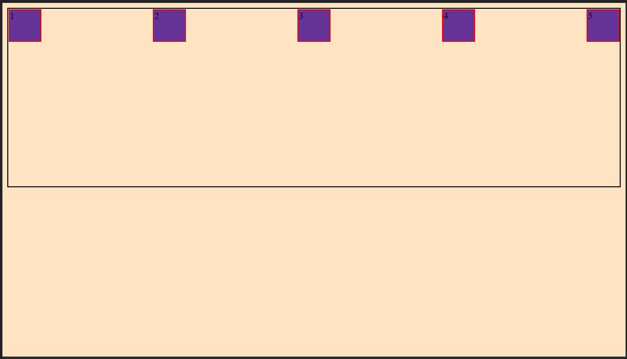
copy following code (You know where to put it)
HTML
 <div class="main">
        <div class="child 1">1</div>
        <div class="child 2">2</div>
        <div class="child 3">3</div>
        <div class="child 4">4</div>
        <div class="child 5">5</div>
    </div>
CSS
        body{
            background-color: bisque;
        }

        .main{
            height: 50vh;
            border: 2px solid black;

        }

        .child{
            height: 50px;
            width: 50px;
            background-color: rebeccapurple;
            border: 2px solid red;
        }
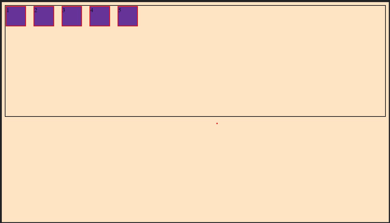
It will look like....
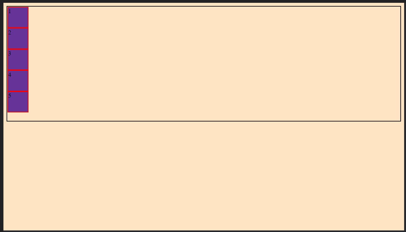
Now let's start with real thing....
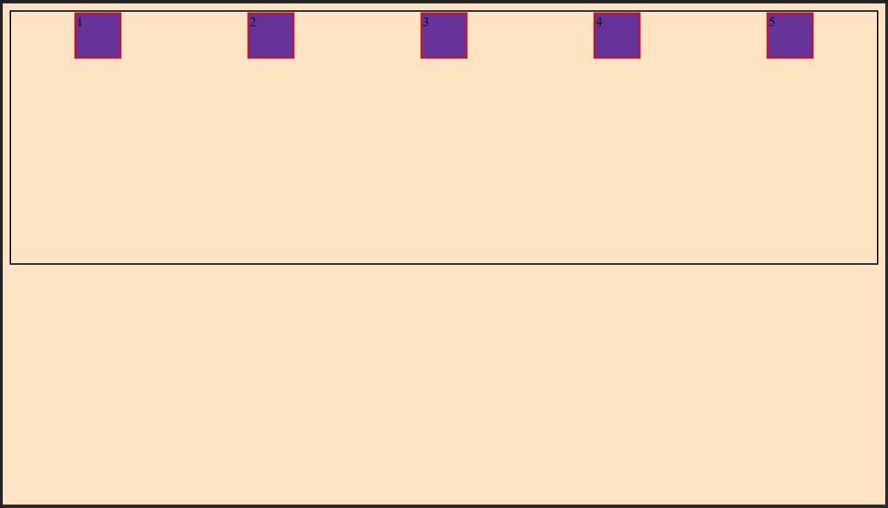
display:flex
The above step is first to do if you want to use flexbox.
    .main{
             display:flex;

            height: 50vh;
            border: 2px solid black;

        }
If you put display:flex in main class what it will do is....
as you can see what it does is , it aligned all children to it's main axis.
Before going further you should know what main axis.
On computer screen by default main-axis is horizontal(you can imagine right)
By understanding above statement we can move to our flexbox properties.
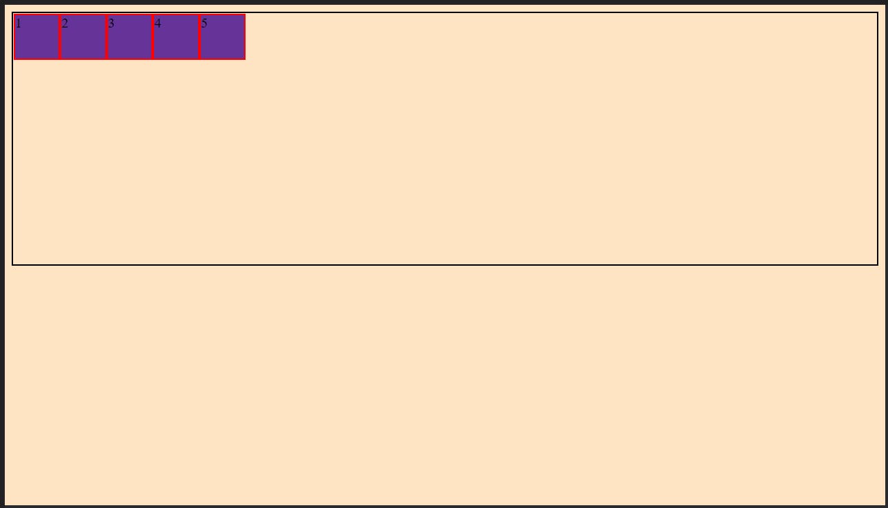
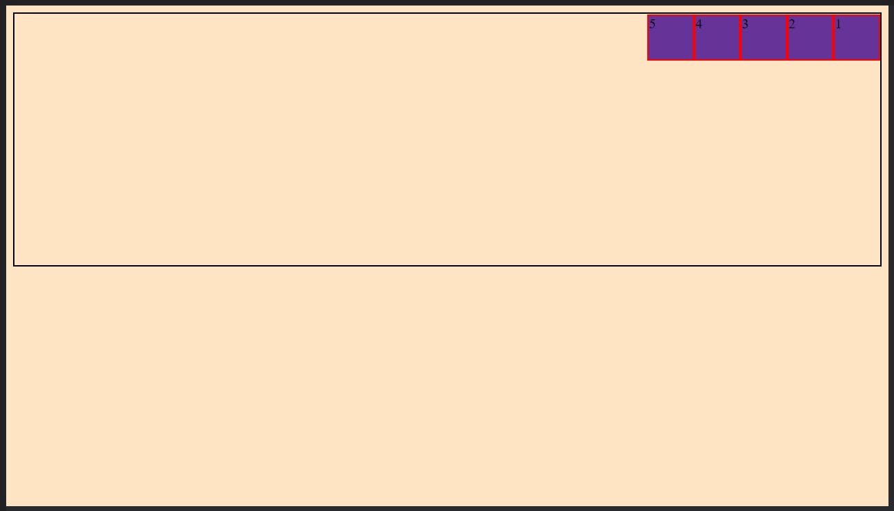
As you can see when we did display:flex to main class (parent) it's all children came in row, we can say it aligned with it's main axis, right!.
In flexbox there is property called flex-direction (right you are getting it , tell what it could be?)
flex-direction:row;
right as we saw all children came in row, the default value of flex-direction is row
Ok got it got it, now what is this what flexbox is , NO.. we have just started
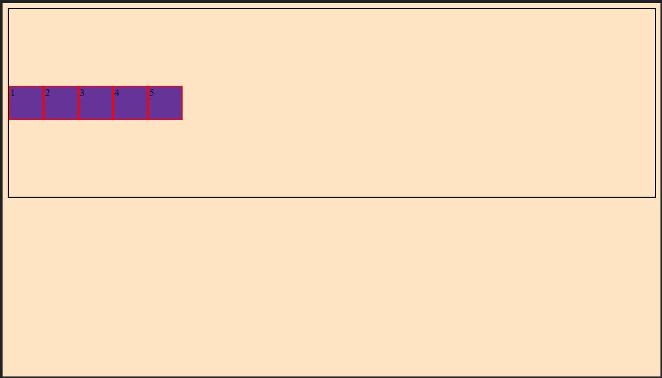
justify-content
as same suggest what it does is it justified content(all children inside parent main class is content). But thing to remember is mark this line- * justify content only justifies content on main axis here it is horizontal(left to right**).
if we add following in our main class (copy that code in your main class and do along with me)
justify-content:center;
we will see...
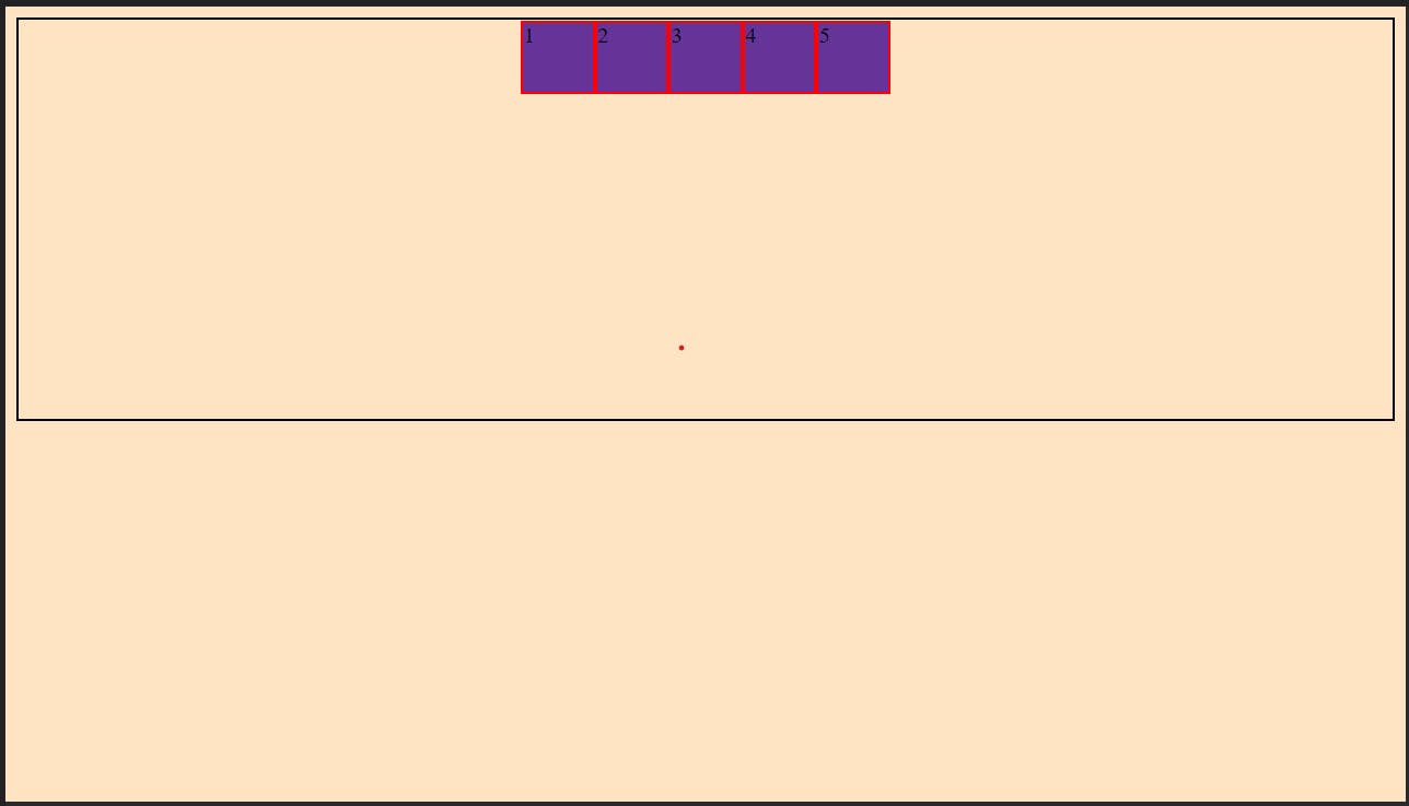
you saw what happened right!
it justified content to center of main axis.
there are also more values for justify-content like- flex-start(this is default one), flex-end, space-between, space-around, etc.
I am not going to tell you all above values(there are more but above are used most, they can do most of your work), but let's see what space-between and space-around do.
if we do (in main class)
justify-content: space-between;
we will see
saw what happened it justified content with space between every children.
let's do space around
justify-content: space-around;
we will see
You understood right!
Ok I know you understood now what if you want to align those children vertically, justify-content is aligning it's children across main axis which is horizontal(left to right)
what if we want to it vertically which is cross axis we will call it secondary axis.
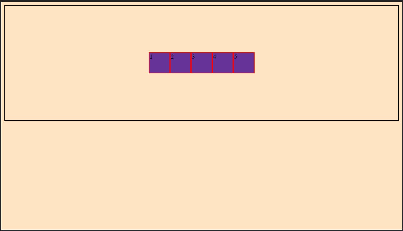
for that we have... align-items
now let's do this(in main class)
align-items: center;
we will see...
as we can see it aligned it vertically means on secondary axis.
there are also other values such as **flex-start(default one), flex-end, baseline,etc.
you can try them and see what they do.
if we give both justify-content:center and align-items:center we will see....
it will go at center of parent main.
You are getting things right.
Do you remember that flex-direction:row what is does that it makes flex-direction to row, we don't have to define it as it default. But there are more values for flex-direction which are- column, row-reverse, column-reverse,etc.
as name suggest what column value does it moves our main axis from horizontal(left to right) to vertical(top to bottom)
Yes again the term main-axis came right(I told you what it is, you can read again if haven't understood)
why this term is important because our justify-content and align-items properties revolve around that.
I as told you justify-content helps to align our content on main-axis which horizontal(left to right) when direction is row, but when flex-direction is column , the main axis move from horizontal(left to right) to vertical(top to bottom), the justify-content will justify that content vertically and align-items horizontally. Yes things kind of reverse with flex-direction changes from row to column.
You can do that changes and see how it turns out.
OK you have seen that there are also row-reverse, column-reverse values also, what they do.
You can see above I have also written left to right , top to bottom with horizontal and vertical respectively. There is reason for that.
when we do flex-direction:row-reverse what happen is ...
as you can see what is does is that it changes direction of horizontal(left to right) main-axis to horizontal(right to left).
same with column-reverse, you can try, You wont get things until you try.
above properties was for aligning right there also some other useful properties
gap:20px;
what it did is it added gap of 20px between each child.
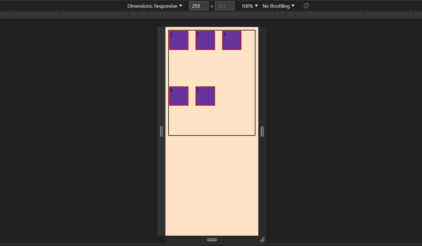
flex-wrap
this property can be very useful for responsiveness of website. if we give flex-wrap: wrap to parent what happen is when width of screen decreases it will wrap the elements inside parent.
flex-wrap:wrap;
you saw in previous image the width is full, if we decrease width of screen what will happen is....
I think that's it for this article, I hope that article helped you.
Thank You